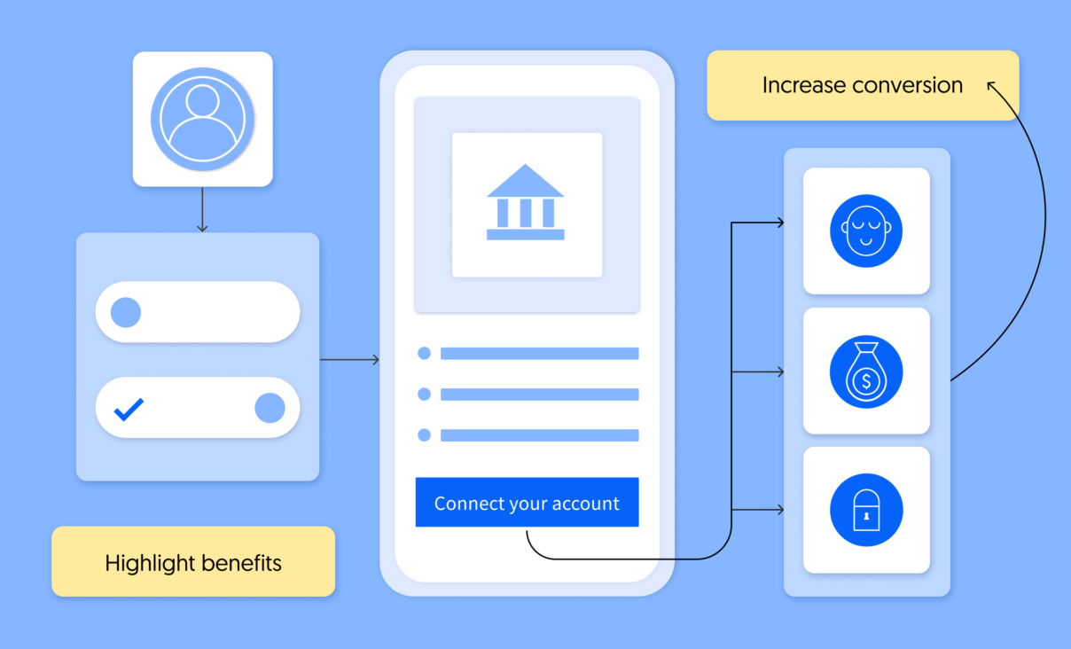
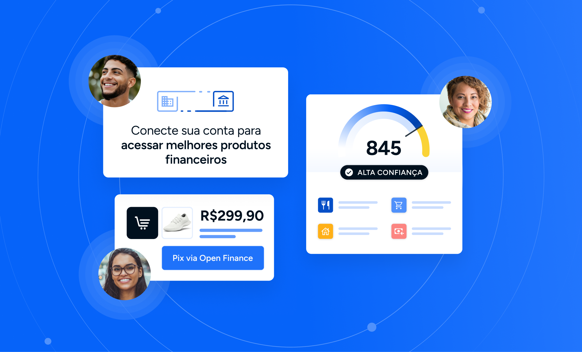
Mastering UX is key for companies building services on top of open finance connectivity. Here, we outline some of the main lessons we’ve learned by helping our customers connect their apps with their users’ financial data while ensuring trust and conversion.
Table of Contents
- UX principles to improve conversion
- Make the user feel assured
- Highlight the benefits
- Provide an agile flow
- Be transparent
- Provide security
- Build trust
- To sum up
Belvo’s goal is to accelerate the adoption of open finance solutions in Latin America. In order to do so, we provide a series of tools to help financial innovators connect their apps with their users’ financial data using our API platform.
One of these tools is our Connect Widget: an account authentication interface that companies can easily integrate into their products –saving months of development– to allow their users to securely link their financial data with their apps in just a few clicks.
Many financial innovators are already using our widget to replace outdated manual data collection systems and improve their conversion rates. For example, to provide faster approval rates when offering credit services.
UX principles to improve conversion
We work closely with our customers to help them make the most out of our tools and, during this time, we’ve learned some valuable lessons about what makes a great UX when sharing financial data.
For example, we’ve learned that a key aspect to drive conversion while designing a customer journey is to highlight very explicitly the benefits users will gain from sharing their data. It’s also relevant to always give them enough information and context so they can make informed decisions throughout the whole process. All of this while reassuring that their data is protected and safely stored.
In this article, we have collected some key recommendations that financial innovators can follow when integrating the widget, to make sure their customer journey UX hits the right notes and drives the best conversion rates:
Make the user feel assured
A key element is to transmit a sense of ownership in each step of the customer journey. Part of this process involves communicating effectively that users can revoke access to their financial data at any time.
We’ve seen that users are more likely to share their data if they can perceive clearly that they are in charge of the process end-to-end.
How to make it visible?
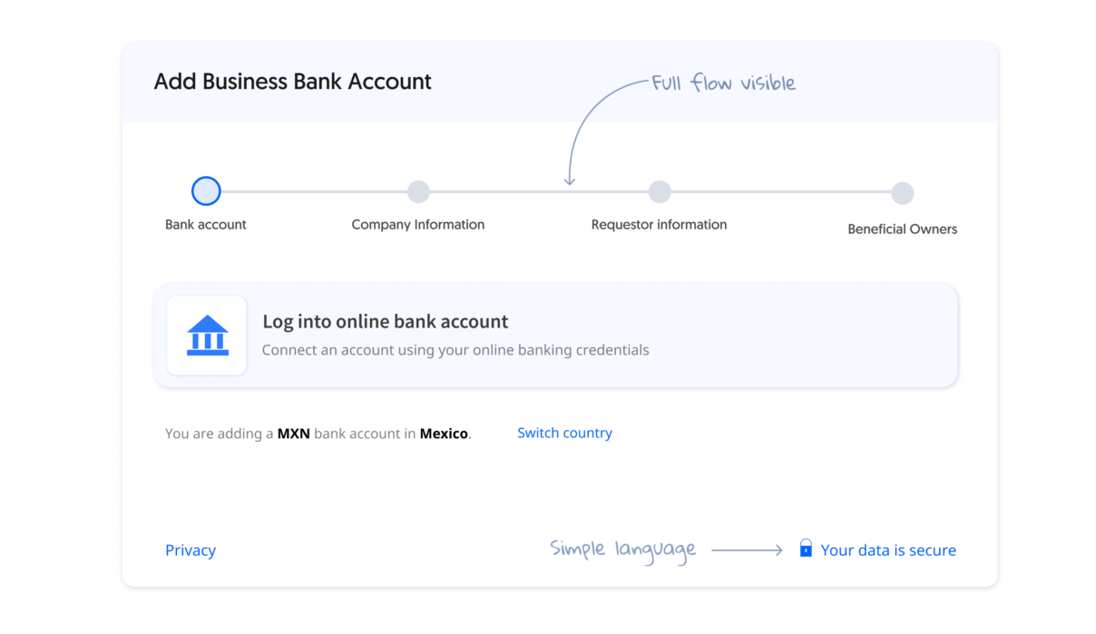
- Allow users to visualize flow stages.
- Navigation using horizontal swiping tends to convert more than traditional vertical scrolling.
- Mention that users will have the power to revoke access to their data. Ideally, this process should also be easy to perform.
Highlight the benefits
Customers will be more willing to connect their financial accounts and share their information if the value and ROI they will get from open finance solutions are clear enough.
How to make it visible?
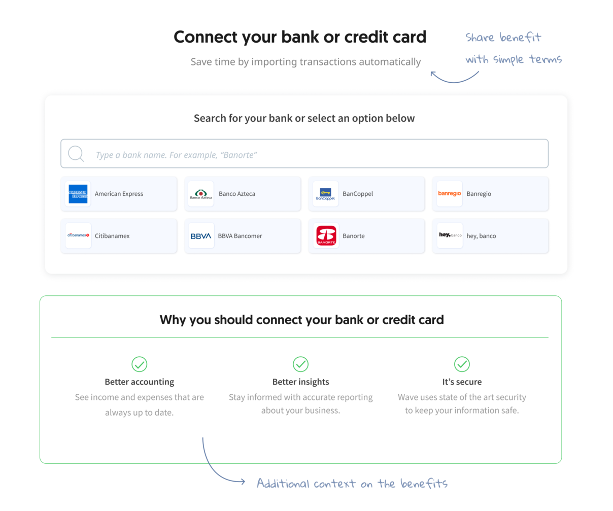
- Explain clearly the value and benefits they will get by connecting their financial information with short and clear sentences, always from the user’s point of view.
- For example, having their credit approved faster, having all their information in one place, having access to cheaper rates, or a wider range of services.
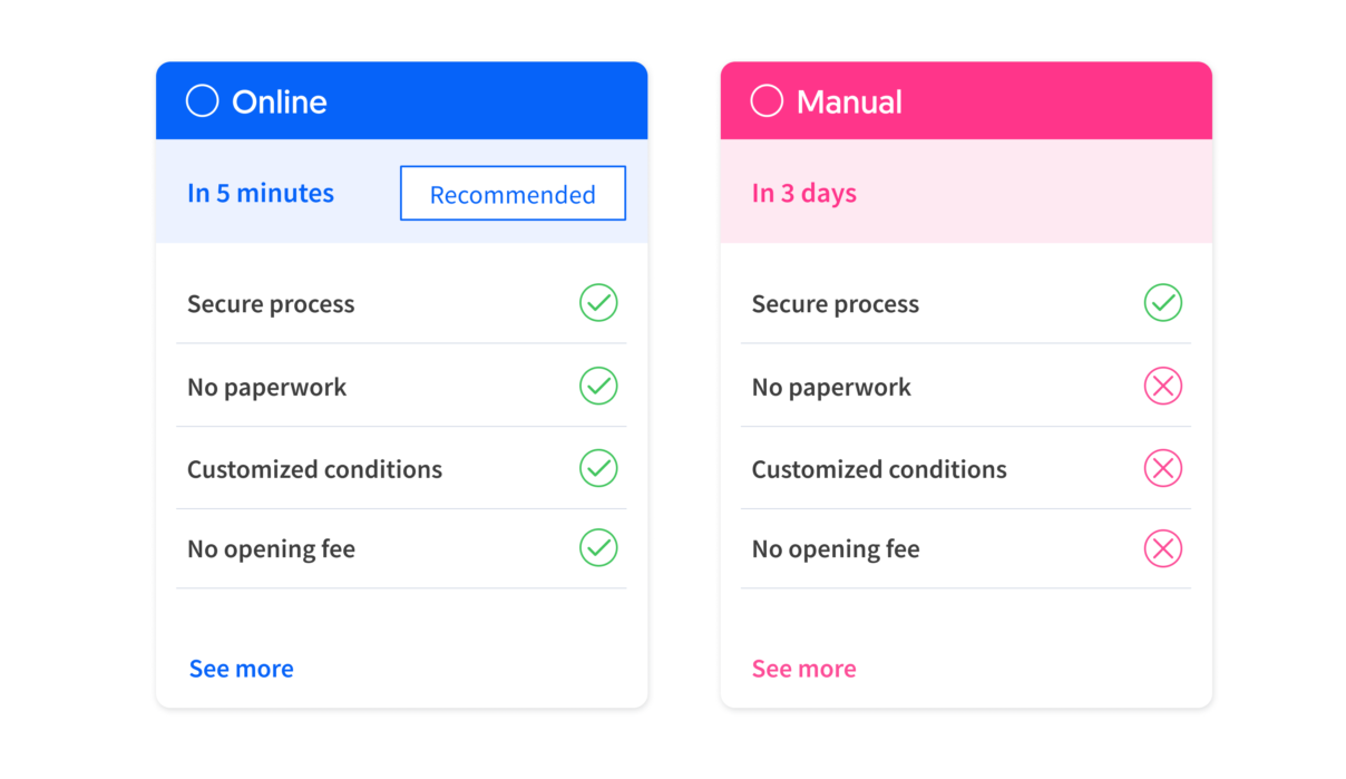
- Compare the benefits to traditional systems that are often less appealing. For example, replacing time-consuming processes such as uploading PDFs or filling in long forms.
- Prompt the account linking option in a relevant step and with a context. For example, directly behind a benefit or added value.
- Make it clear for your users that connecting their financial data is the recommended option. Add ‘Recommended’ or ‘Preferred’ tags to steer users to the best flow.
Provide an agile flow
Users prefer experiences that are tailored to their needs. Personalize the experience according to the specific context of each customer. And build each interaction with efficiency and clarity in mind, without neglecting security.
How to make it visible?
- Design your customer journey considering the most comfortable cadence for your users.
- Each step must contain enough context to help the user make an informed decision and move through the flow.
- Avoid data burden by sharing only the information that makes the most sense according to the current step of the flow.
- For example, show only the relevant institutions according to your end users’ country or to your service—if you use Belvo to let your users select a deposit account, it wouldn’t make sense to show fiscal institutions.
- But don’t rush it! Agility doesn’t necessarily mean building the fastest way to complete the flow.
Be transparent
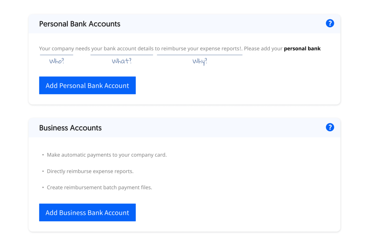
Explain with simple language the data that will be collected, who will be using it, and what they will do with it. If users decide to revoke access to their data, communicate clearly the consequences of doing so.
How to make it visible?
- Personify who will be using the data.
- Explain which data will be collected and the reasons why.
Provide security
Customers will be more willing to connect their financial data with your app if they trust that the service is secure. In order to make it abundantly clear, be explicit about the security mechanisms implemented to protect their data at every time, all while maintaining a relaxed tone.
One important aspect is to explain to customers that their financial details will only be accessed through secure technology-enabled mechanisms in an automatic way, but never personally by an individual, and always with their express consent.
How to make it visible?
- Reassure customers that their data will never be shared without their expressed consent.
- Provide clear and understandable messages about security. For example, mention that their data is encrypted during the whole process.
- Emphasize that data will always be stored securely and won’t be shared with third parties.
Build trust
Building a trustworthy experience will be the main driver during the design of a customer journey. You can achieve it by being supportive, reassuring, and by addressing their needs and concerns in a simple and clear way.
How to make it visible?
- Provide additional context that makes users understand why they need to follow each step.
- Use social proof claims to let your users know that other customers are already benefiting from this service. For example: “Over a million accounts already connected”.
- Use conversational language that users can identify with and understand.
- Customize the widget using your brand logo and colors and include custom messages that are tailored to your users. Learn how to do it!
To sum up
Implementing these UX best practices can help your users feel confident through the whole connection process. Give them clear information to understand each step, be transparent about the use that you’ll give to their data, and –always– highlight the benefits that sharing their data will bring to them.
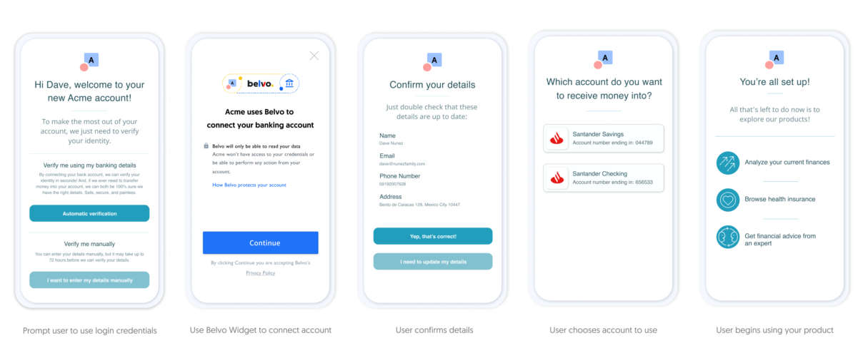
Here’s an example of a customer journey that preserves the essence of each of the principles outlined above. In this case, users would connect their banking accounts to an app using Belvo to verify their identity. Click on the image to enlarge:
And remember, each financial solution and brand is different: do A/B testing with different presentations to understand your customers’ needs and optimize conversion.
Looking for inspiration? Read our white paper about how leading fintech companies across the world are already building better customer journeys using open finance and open finance technologies.

